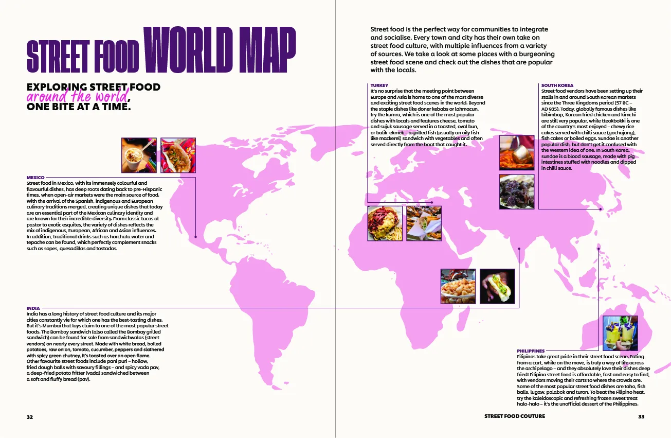
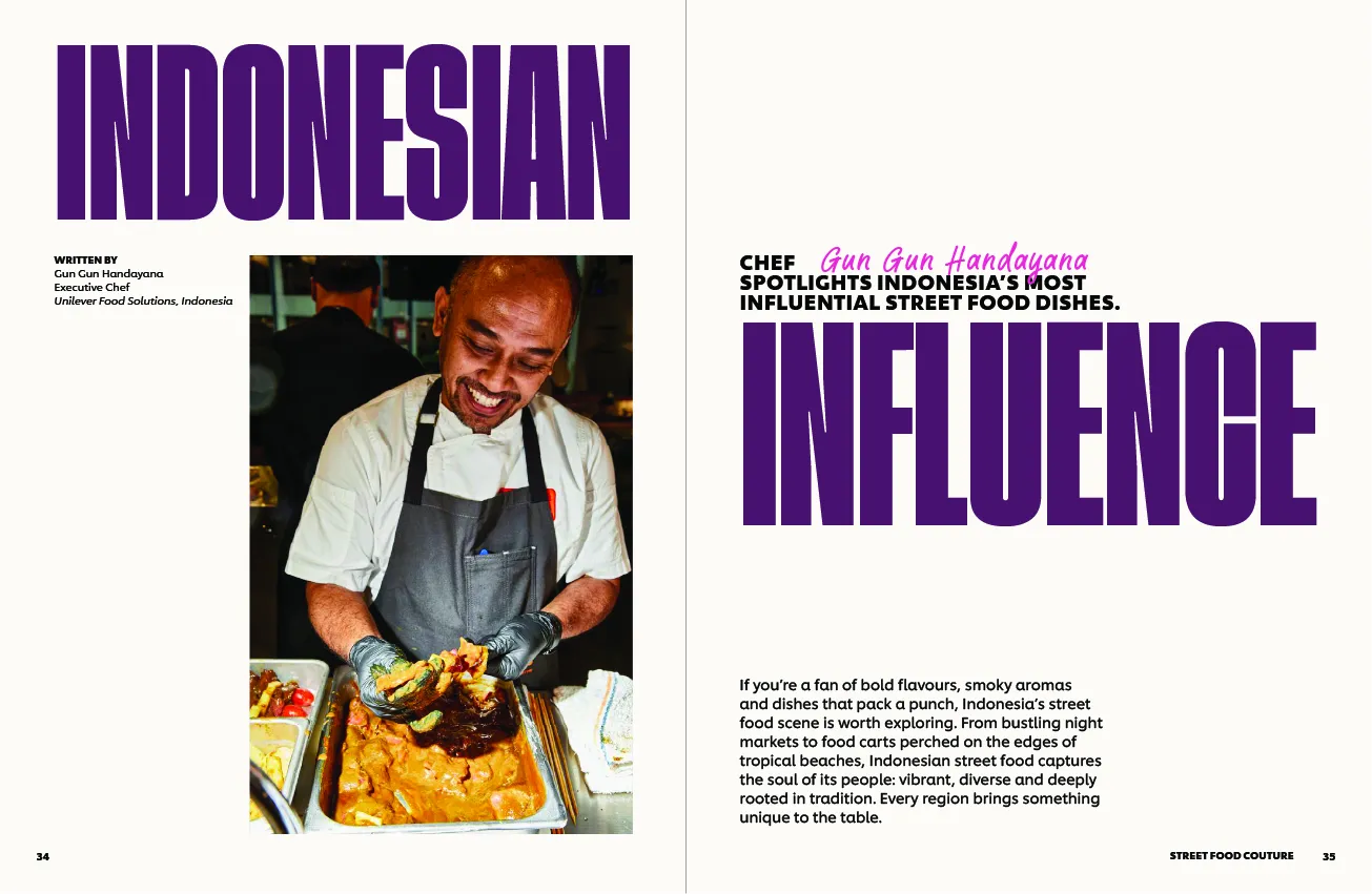
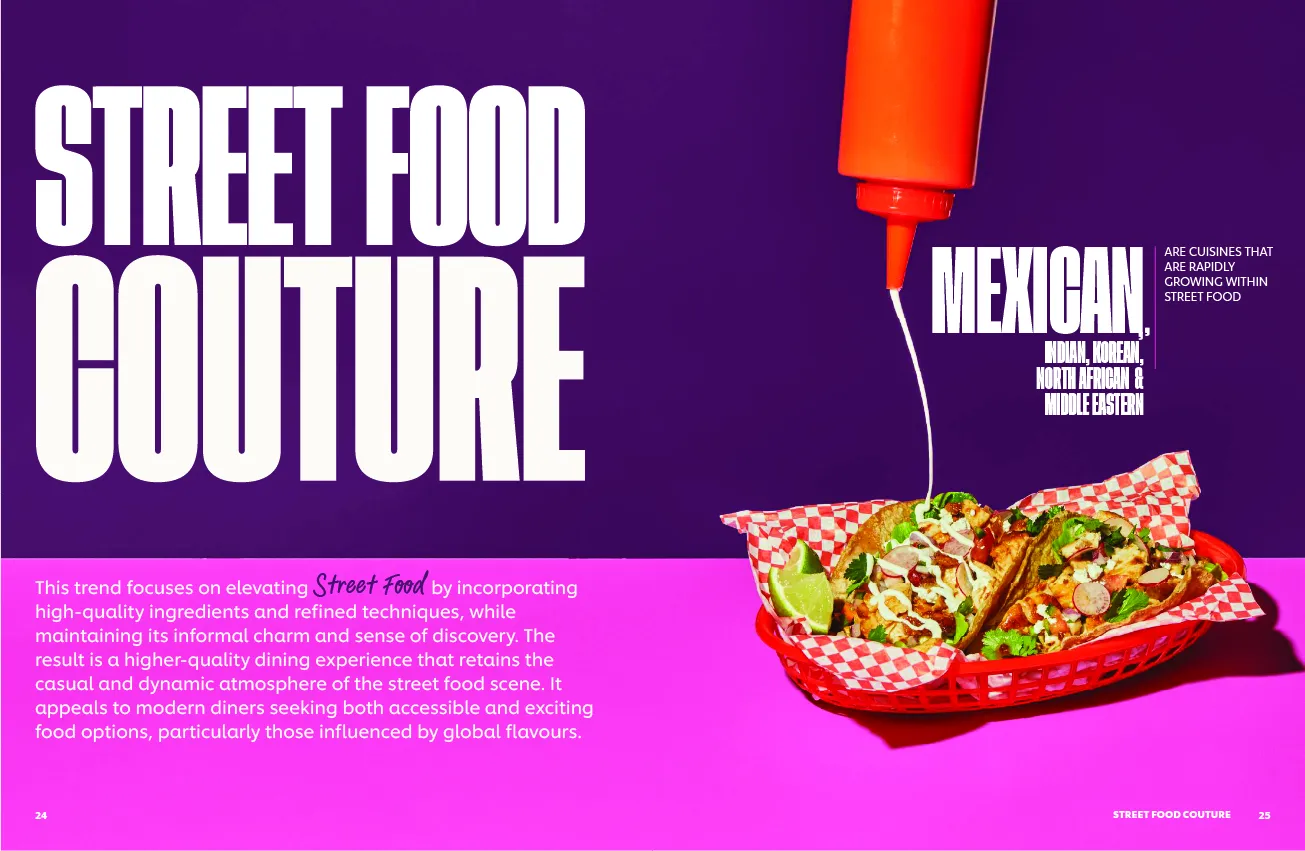
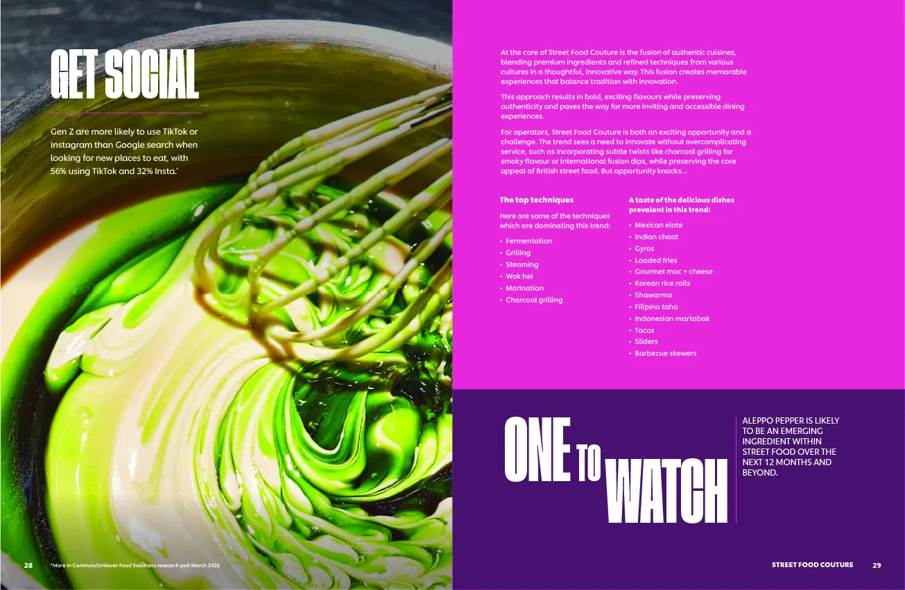
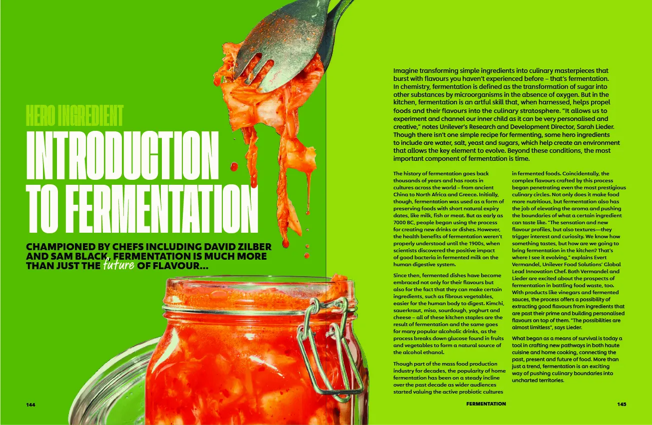
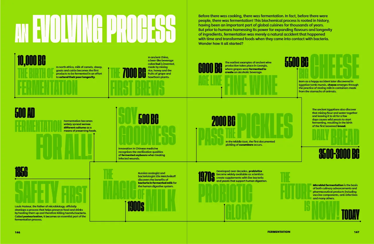
My contribution, as part of a multi-designer collaboration, focused on executing impactful layouts, visual storytelling through imagery, and crafting a design system that elevates the culinary data without overwhelming the reader.
Context
The report needed to serve as both a strategic tool and a compelling piece of visual communication. Our goal was to ensure the content remained digestible for chefs and food business owners, while also staying vibrant and on-brand.
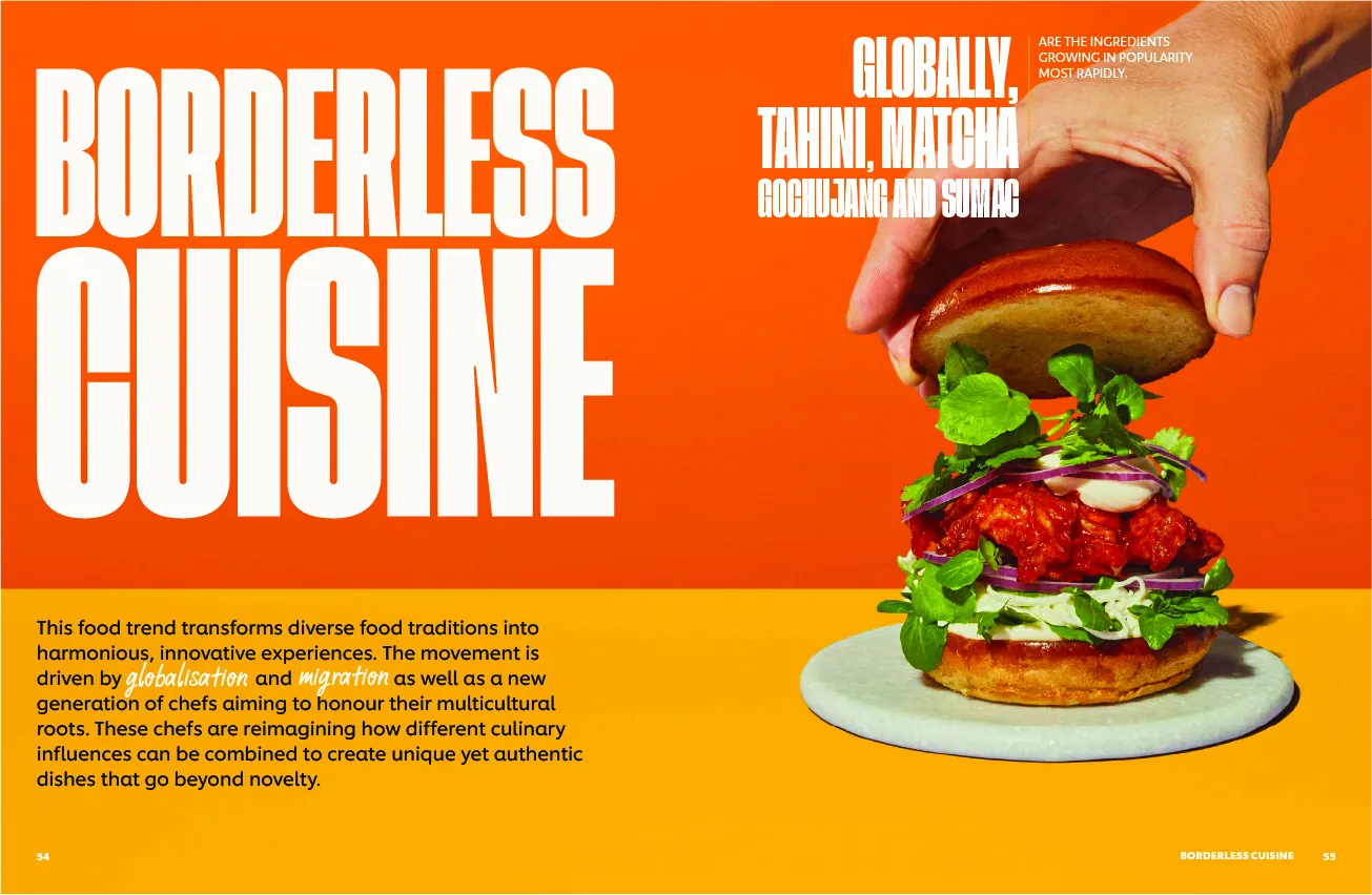
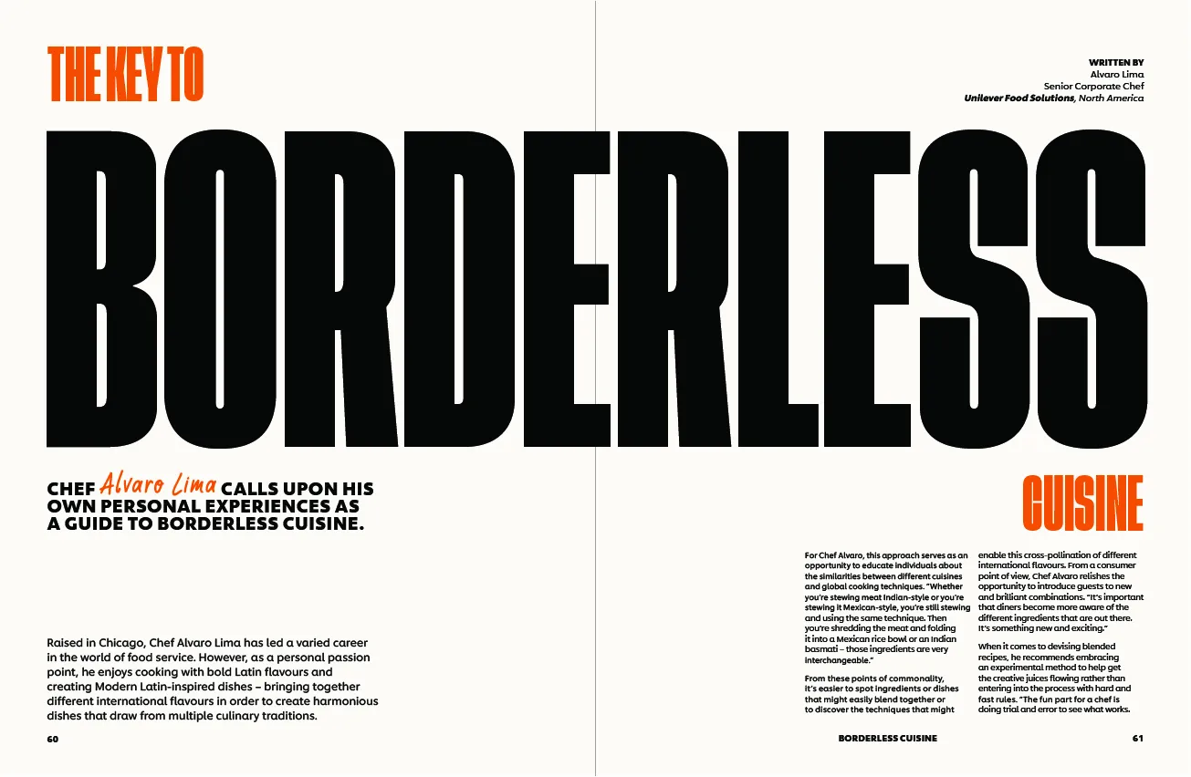
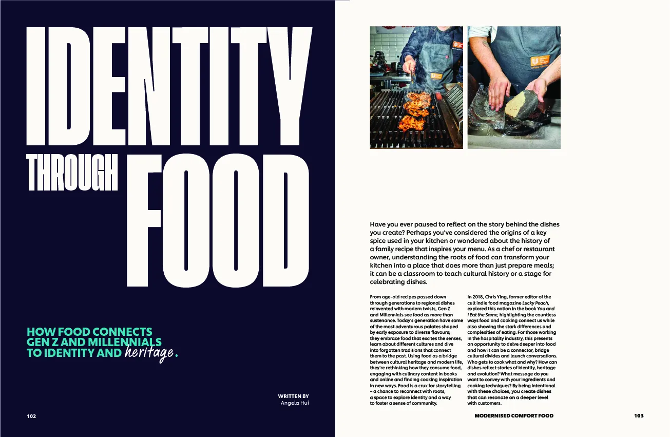
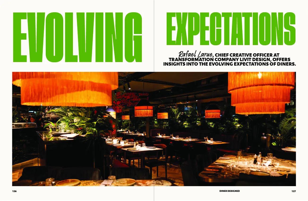
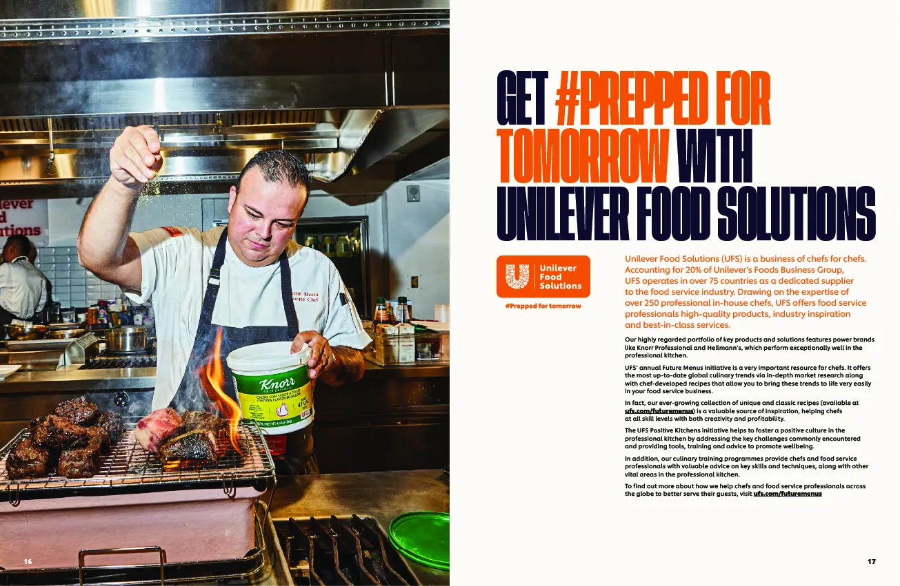
This meant combining data-driven insights with large-format typography, expressive photography, and bold colour treatments making each page a standalone visual narrative.
Details
Role:
Visual Designer / Editorial Designer
Involvement:
Layout Design, Typography & Colour System,
Overview
The Future Menus trend report by Unilever Food Solutions is an annual publication designed to provide chefs and food service professionals with globally researched culinary insights. In its third edition, the 2025 edition aimed to merge rich editorial content with an engaging and visually powerful experience
Challenge
One of the main challenges was designing for global readability and engagement while maintaining cohesive branding standards. The report included diverse contributors, varied culinary topics, and regional imagery that required visual consistency.
Another critical aspect was ensuring that typographic hierarchy remained intuitive across multiple spreads with different content densities ranging from interview features to statistical breakdowns.
Solution
Layout:
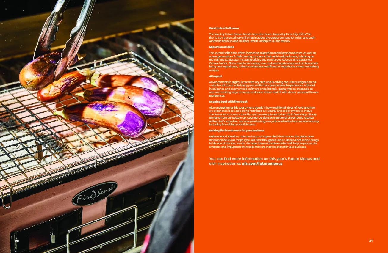
Each spread was approached with a modular grid system that could adapt to various content needs long-form interviews, trend spotlights, and macro imagery. This grid system allowed for fluidity and editorial rhythm, making every page feel distinct while maintaining visual harmony.
Typography:
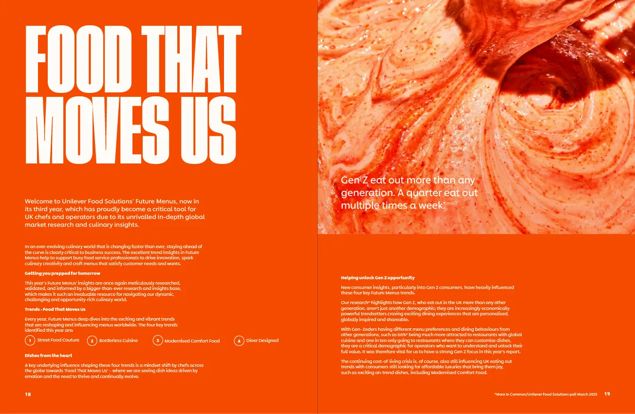
Bold, condensed headlines in uppercase were used to create instant impact, particularly for key themes like “Food That Moves Us” or “Indonesian Influence”. A contrasting sans-serif body font was chosen for legibility and tone balance, enabling content-heavy pages to remain approachable and well-paced.
Colour:
The colour strategy leaned into high-contrast pairings: saturated oranges, deep purples, and clean whites. These choices reflected both the energy of global street food and the vibrant culinary cultures being highlighted. Orange, a recurring theme colour, reinforced brand identity and emotional warmth key to engaging a culinary audience.
Results
The final report was distributed digitally and in limited print runs to global hospitality professionals, receiving positive internal feedback for its visual clarity, modern editorial design, and brand alignment. The use of bold typographic storytelling, consistent colour themes, and rich food photography significantly improved engagement metrics compared to previous editions.
This project demonstrated the power of editorial design thinking in a corporate marketing context and further reinforced the value of collaboration in achieving scalable visual systems for branded content.
