FoodFiTi is a purpose-driven brand aiming to help families especially parents make nutritious food a joyful, conflict-free part of everyday life.
Context
The goal of the project was to develop a holistic brand identity and visual language that resonates emotionally with caregivers while empowering them with a sense of support and community.
This project required a deep understanding of the emotional barriers and pressures parents face around food, as well as the cultural nuances in how family meals are perceived. The branding needed to go beyond appearance and tap into real emotional insights.
Details
Time Frame & Project year :
1M-2023
Role:
Logo/Designer, Style Guide
Involvement:
Brand Identity Design, Visual Language,
Brand Strategy: Tension & Insight
Tension: Parents want to provide nutritious meals for their children, but doing so often leads to stress and conflict at mealtimes. This creates friction, turning something intended to be loving and nurturing into a daily struggle.
Insight: Many parents avoid food-related arguments, but in doing so, they feel like they’re giving in or failing. The emotional impact is subtle yet significant feeling alone in the struggle, while it appears that others are succeeding.
Challenge
A primary challenge was building a brand that could speak directly to a parent’s emotional experience without sounding overly medical or preachy. The balance between authority and approachability was critical.
Additionally, translating culturally inspired elements (like the Adinkra motifs) into a modern design system required nuance and respect. We had to make sure the identity felt warm, inclusive, and authentic yet functional across digital and print media.
Solution
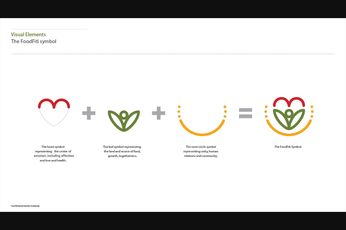
We developed a modular identity system that could scale across formats and media. The FoodFiTi logo combines a heart (representing love and family) and a leaf (symbolizing nutrition and nature), surrounded by circular harmony. Together, they convey nourishment, support, and care.
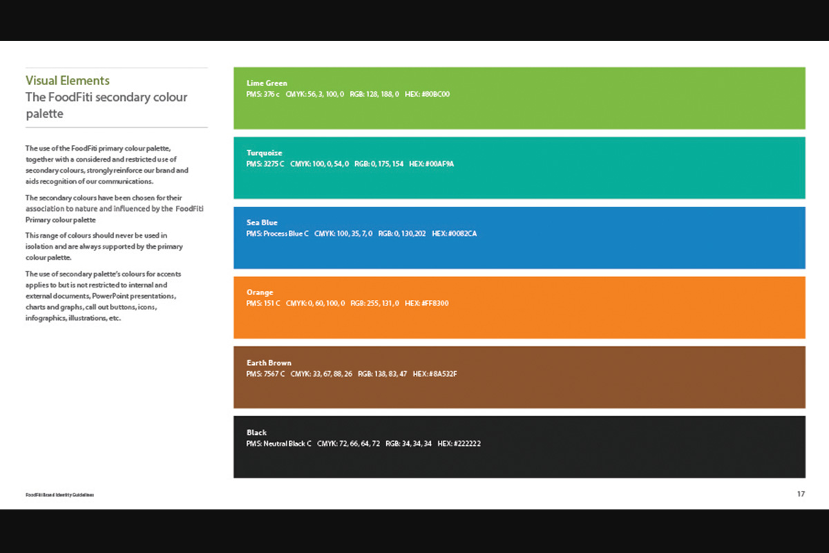
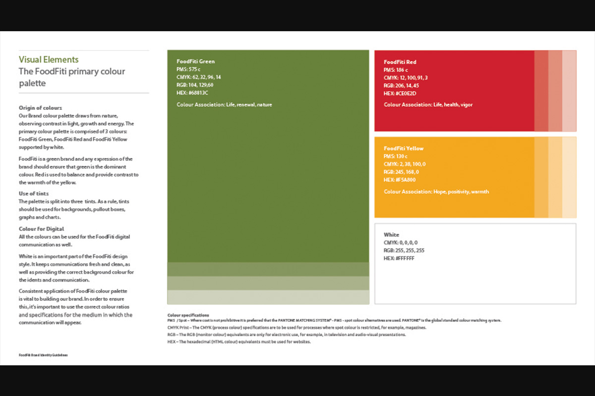
The primary color palette of earthy greens and vibrant oranges builds trust while maintaining energy. A secondary palette provides flexibility for campaign-specific designs.
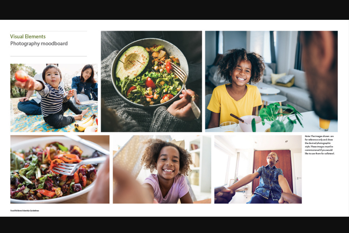
Photography guidelines emphasized authentic, joyful moments with real families, reinforcing relatability and warmth. Visuals focused on everyday scenes parents preparing meals, children enjoying food to build emotional resonance.
Typography was chosen for its readability and friendliness, supporting the brand’s mission of accessibility.
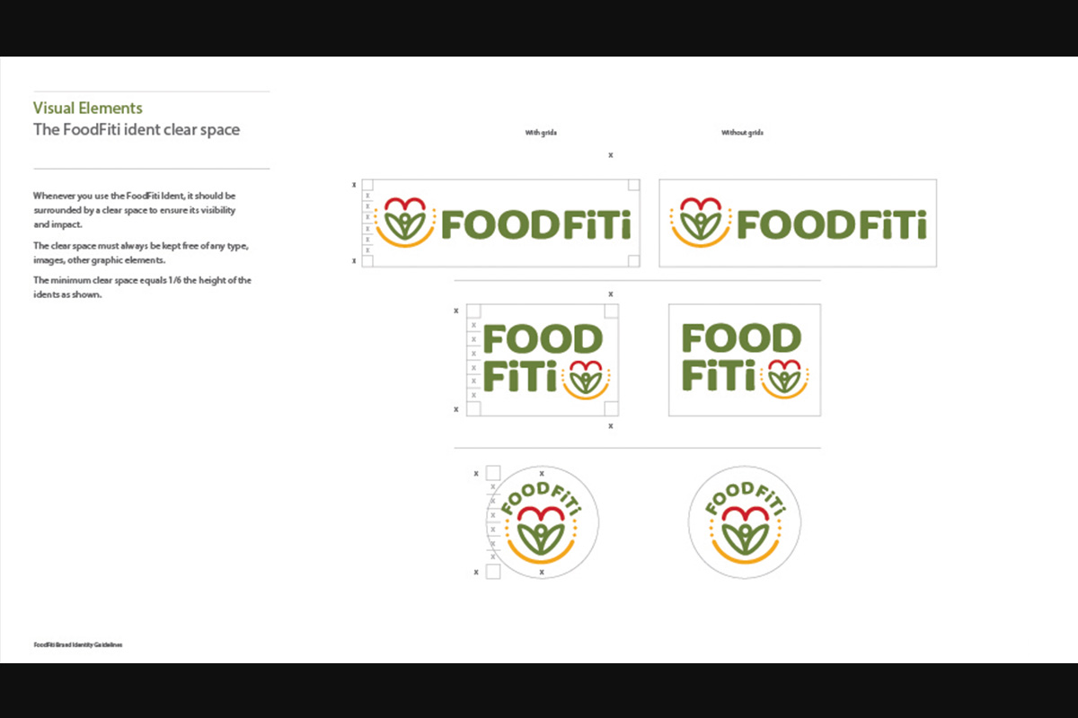
The complete brand guideline ensures consistency across all touchpoints, from packaging to social media to internal communication.
Conclusion
The FoodFiTi brand is built on empathy, insight, and intention. It is more than a visual identity it’s a promise to parents that nutritious food can be a positive and stress free part of family life. By aligning strategic storytelling with visual clarity, we created a brand that empowers, uplifts, and connects.
This case study showcases how deep human understanding paired with thoughtful design can transform a brand into a movement.